

Campus switching is the real task
Users choose what works now, not a fixed mode. Train and ride shares are two ways to complete the same campus switch under real constraints.
Penda
A university mobility platform for campus switching where drivers offer seats and commuters find trains or ride shares.
At the Lucerne University of Applied Sciences and Arts, students and lecturers often switch locations across departments for modules and cross departmental collaboration. We explored how one platform could support more social connection and community on the move, reduce unnecessary car trips through shared rides, and make commuting more cost and time efficient. My focus was running the Scrum process, shaping the UX direction with the design team, and contributing to frontend implementation. We turned journey and persona work into role based user flows, a structured mid fidelity prototype, and scenario based validation. The project resulted in a complete high fidelity prototype, a scalable design system, and a functional MVP web app demonstrating the end to end experience.
Role
Scrum Master, UX/UI Designer & Frontend Developer
Context
Student team project
Timeline
8 weeks in 2025
Team
Designer: Me, Dario Foti, Yannick Röösli
Developer: Marin Hirschi, Marco Burkhardt
Outcome
High fidelity prototype & functional MVP web app
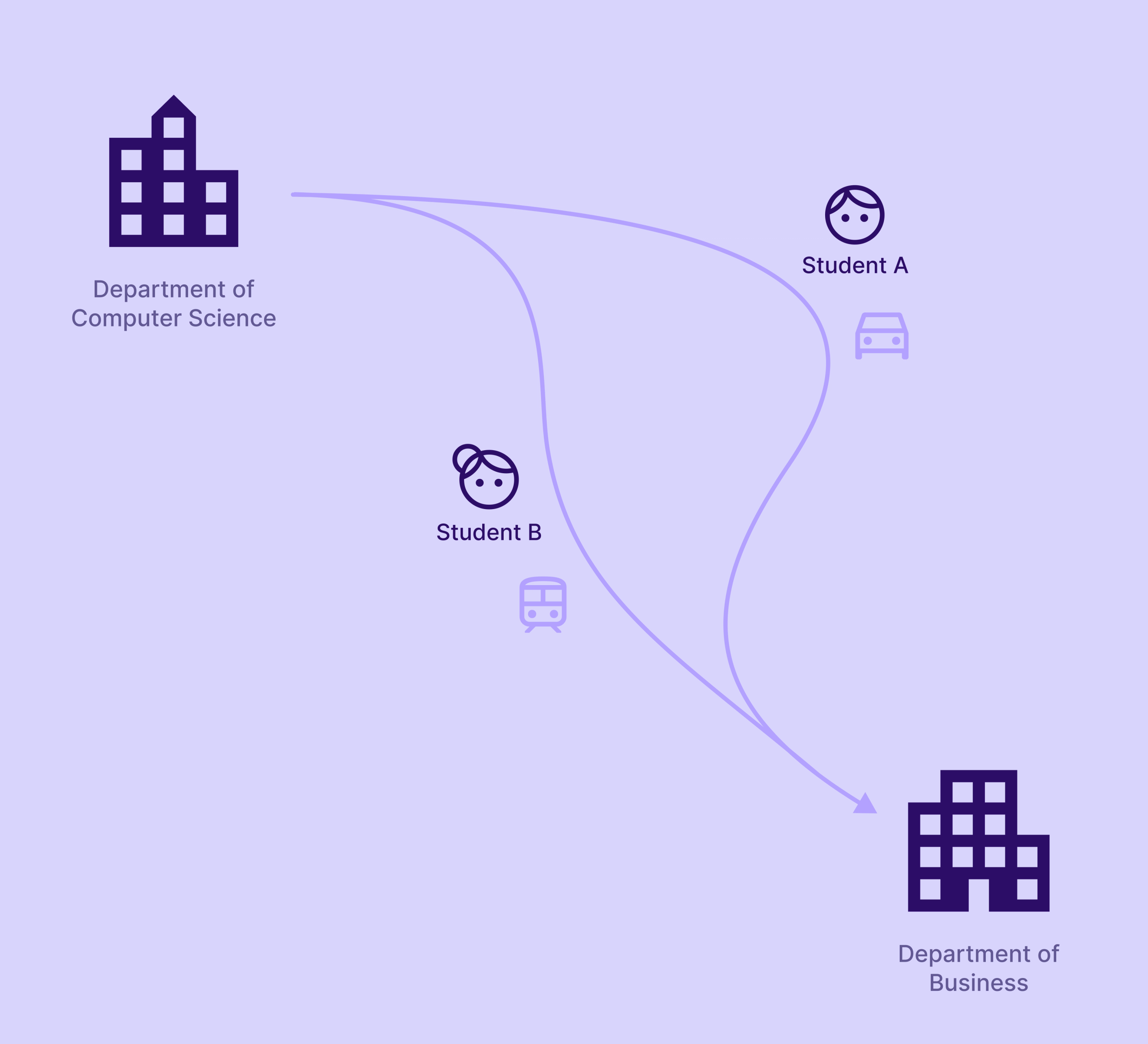
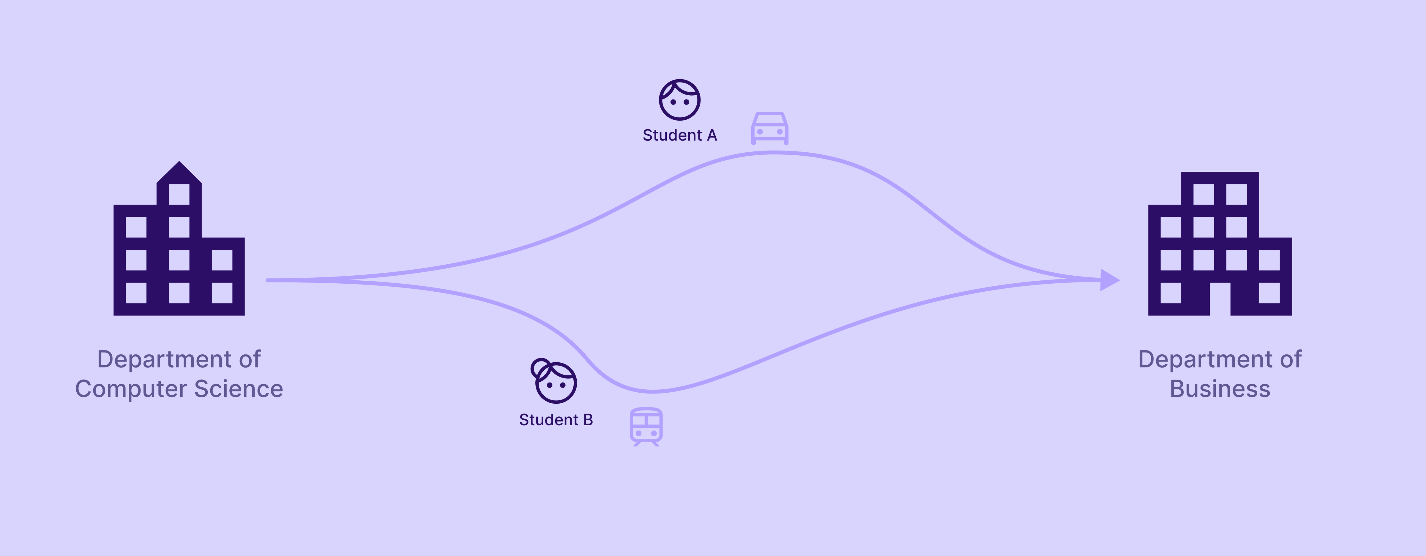
At the Lucerne University of Applied Sciences and Arts, students and lecturers regularly switch locations for modules and cross departmental collaboration. These campus switches are usually treated as a logistical afterthought rather than a designed experience.
In practice, mobility is fragmented. Some people travel by train, others by car, often without knowing that peers are moving along similar routes at the same time. Cars frequently run with empty seats, while train commuters travel alone despite overlapping schedules. Existing transport tools support individual route planning, but they do not enable coordination and shared travel within a university context.
This matters on three levels. Socially, shared travel time is a missed opportunity for informal exchange and connection beyond the classroom. Ecologically, unnecessary solo trips increase emissions despite available capacity. Economically, commuting costs and time are carried individually instead of being shared. Together, these effects show that campus switching is not just a transport issue, but a recurring university pattern that remains largely unsupported.
The project started from a given problem statement, so our early work was not about open ended discovery. Instead, we treated the brief as a hypothesis and focused on making our assumptions explicit and testable as quickly as possible. We expanded the framing to a university wide campus switching pattern and used design led research to understand the decision points behind it.
To build shared clarity within a five person Scrum team, we mapped two core roles, rider and driver, created proto-personas, and translated them into user journeys. We then aligned on an end to end flow that captured the recurring steps, choices, and uncertainties involved in switching campuses by train or car.
Campus switching is the real task
Users choose what works now, not a fixed mode. Train and ride shares are two ways to complete the same campus switch under real constraints.

Riders and drivers think differently
Riders compare options and timing. Drivers manage seats and meeting points. One generic flow creates confusion and friction.

Ride sharing needs trust signals
Ride shares add social uncertainty. Users need clear next steps, status feedback, and enough context to commit confidently.

It’s a repeatable pattern
Campus switching repeats weekly. The flow must stay fast and predictable, especially when plans change.
Based on our insights, the core challenge was not to design separate features for train travel and carpooling, but to support one recurring task: switching campuses under real constraints. The experience needed to work across different routes and transport modes, while staying fast, clear, and repeatable.
How might we simplify the organisation of ride sharing and campus switching for university students, so they can travel faster, more affordably, and more sustainably?
Clear campus switch planning
Users can plan a campus switch and understand their available options without unnecessary steps or detours.
Comparable train and ride share options
Train connections and ride shares can be compared as options for the same task, without forcing separate decision paths.
Easy to understand rider flow
Riders always understand what happens next after joining or requesting a ride, including confirmation and status.
Low effort ride creation for drivers
Drivers can post a ride with only the essential details needed for others to understand and trust the offer.
Fast repeat use
The experience relies on consistent patterns and clear feedback, enabling quick decisions during repeated campus switches.
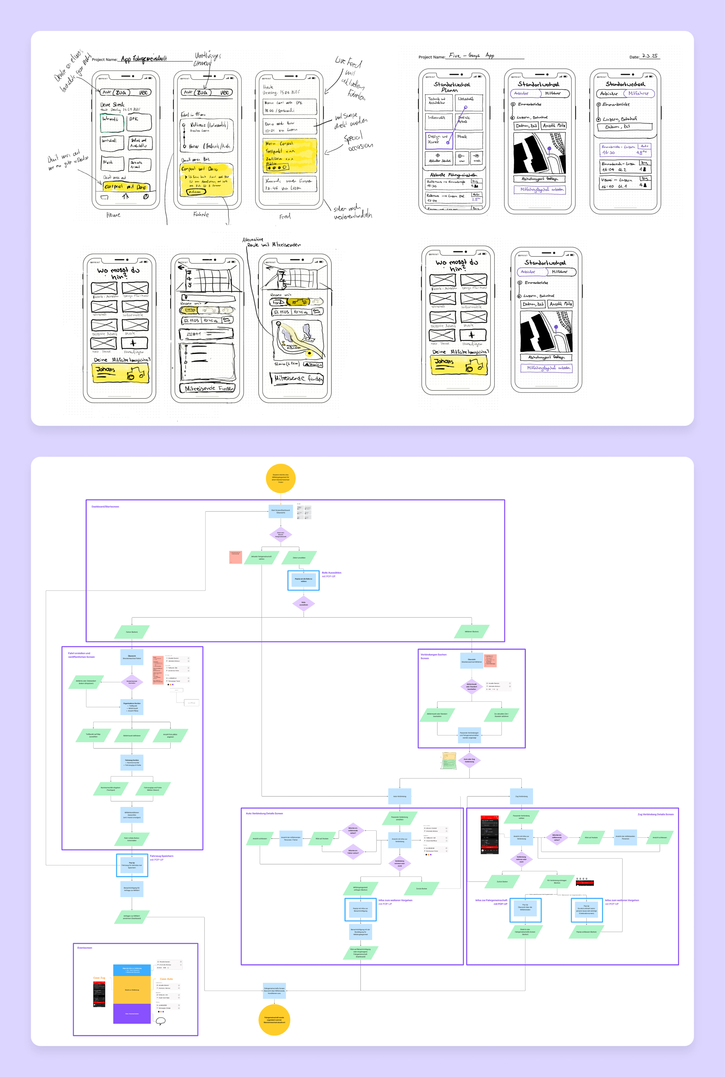
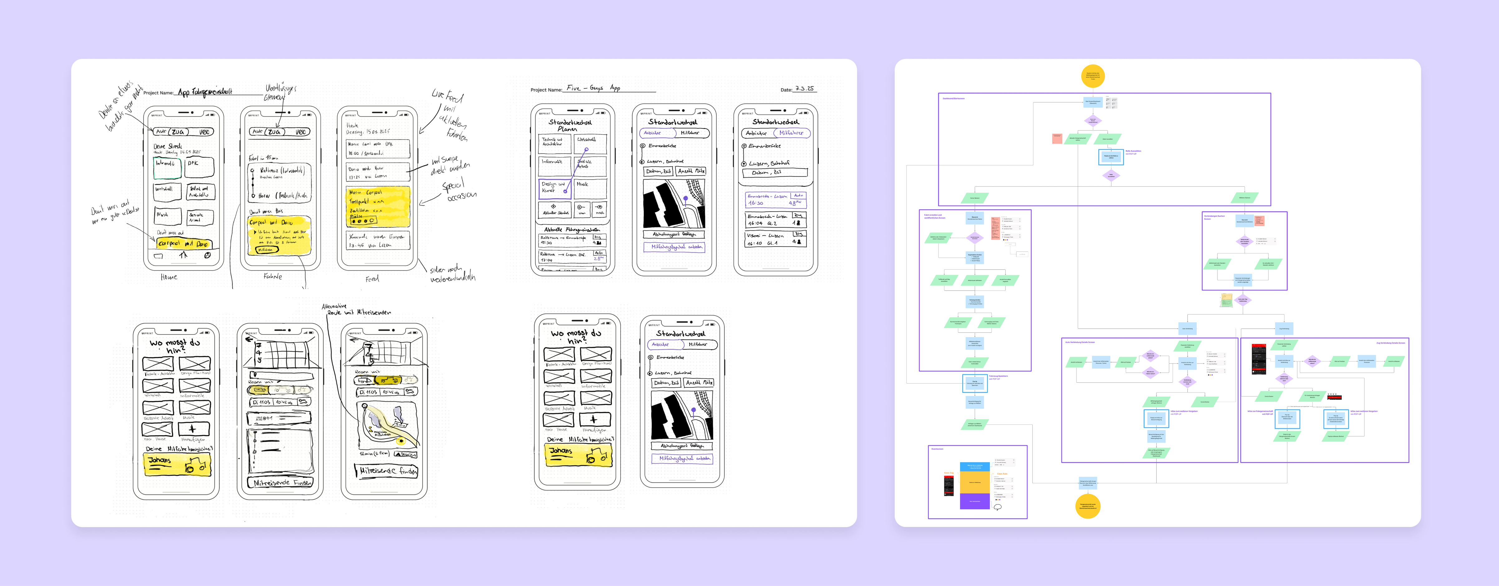
We began with individual low fidelity sketches to explore different approaches to the campus switching experience and to surface assumptions early. Comparing the sketches helped us align quickly on the core task, key entry points, and the role logic behind rider and driver journeys.
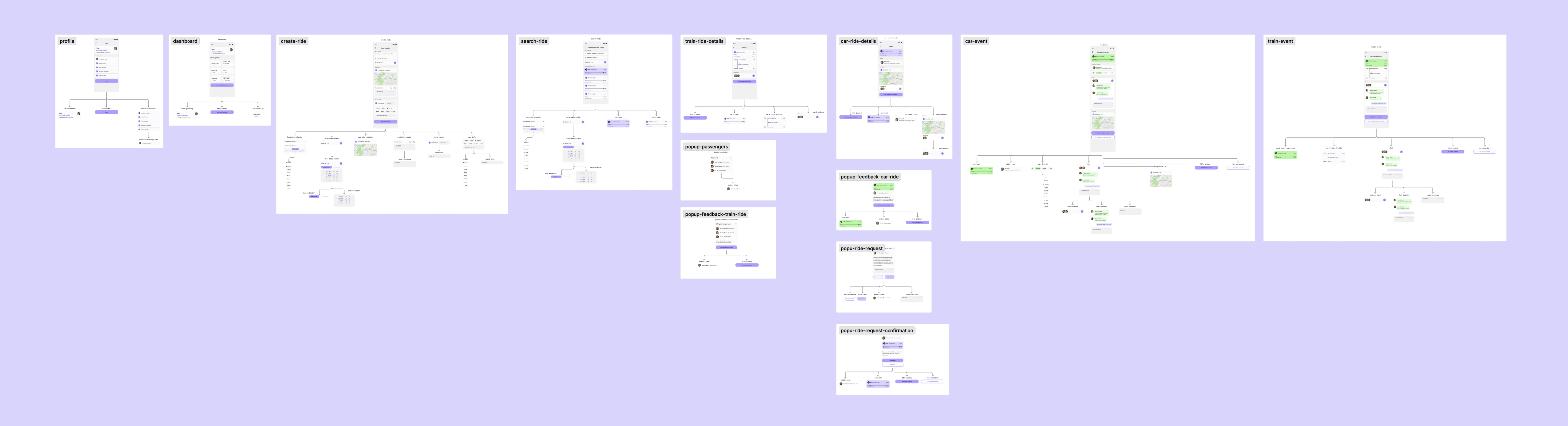
To move forward, we translated that shared understanding into an end to end user flow that mapped tasks, decisions, and system states across both roles. The flow became our blueprint for structuring the product: it helped us group tasks into coherent screens, define what happens in popups, and keep the experience consistent from start to finish.
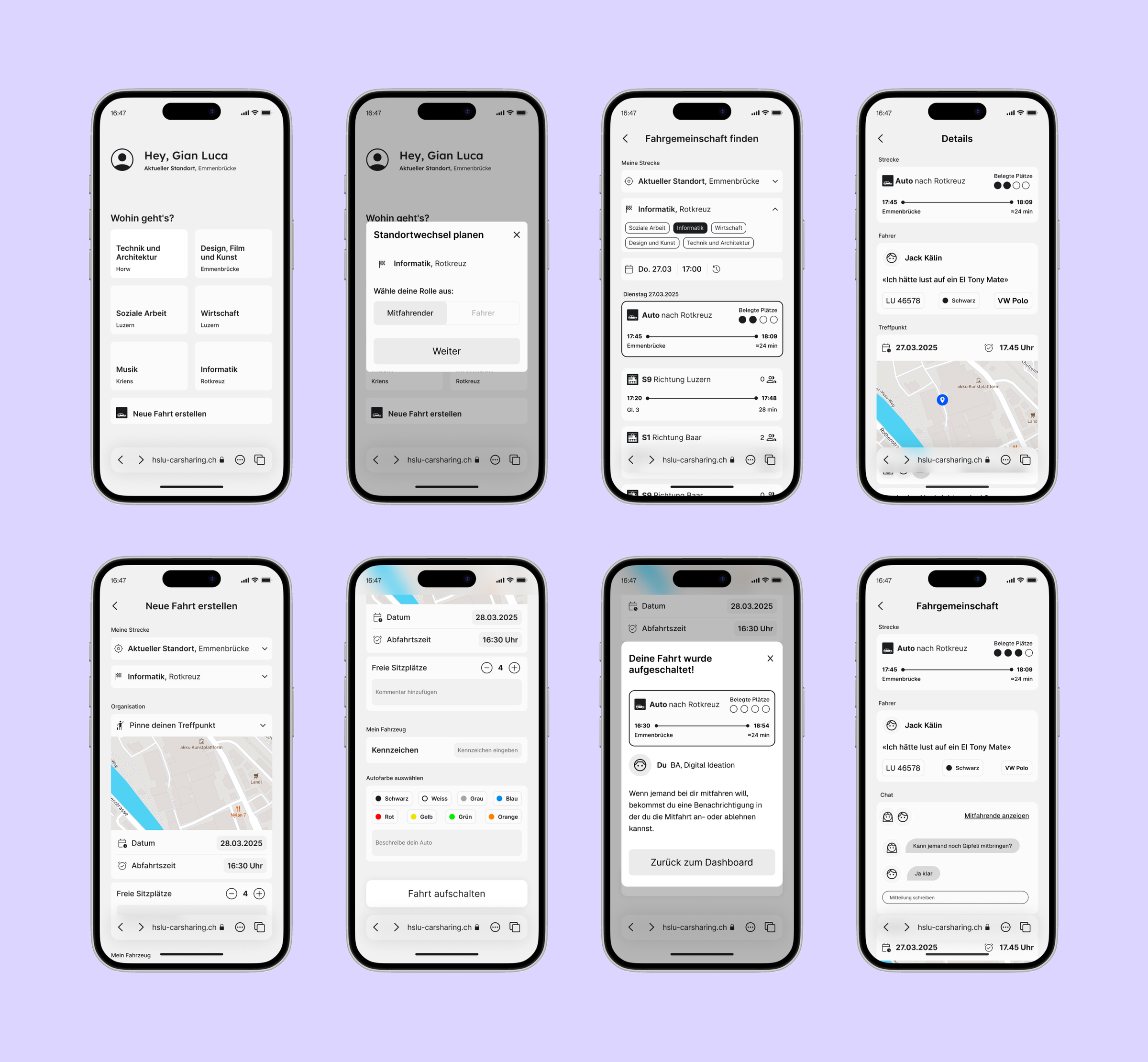
Using the user flow as our structural blueprint, we built an interactive mid-fidelity prototype with conditional states to simulate realistic decisions and system feedback. We kept the visual design intentionally flat and grayscale, so we could test interaction logic without relying on early color coding or visual styling assumptions. This allowed us to focus on whether the flow, roles, and key states were understandable before moving into high fidelity design.
We ran a first round of scenario-based testing to validate the mid-fidelity flow under realistic campus switching conditions. Across three scenarios, we aimed to verify whether users could compare train and ride share options, complete the core tasks for both roles, and correctly interpret key states such as role selection, seat availability, and request status.
Role logic needed clearer entry
Users hesitated when it was not immediately obvious whether they were acting as a rider or driver, especially at the start of the journey.
States had to be more explicit
Seat availability and request status were not always interpreted consistently, so key states needed clearer, more predictable communication.
Small UI cues shaped confidence
Icons, labels, and feedback messages strongly influenced whether users felt confident enough to commit to a ride decision.
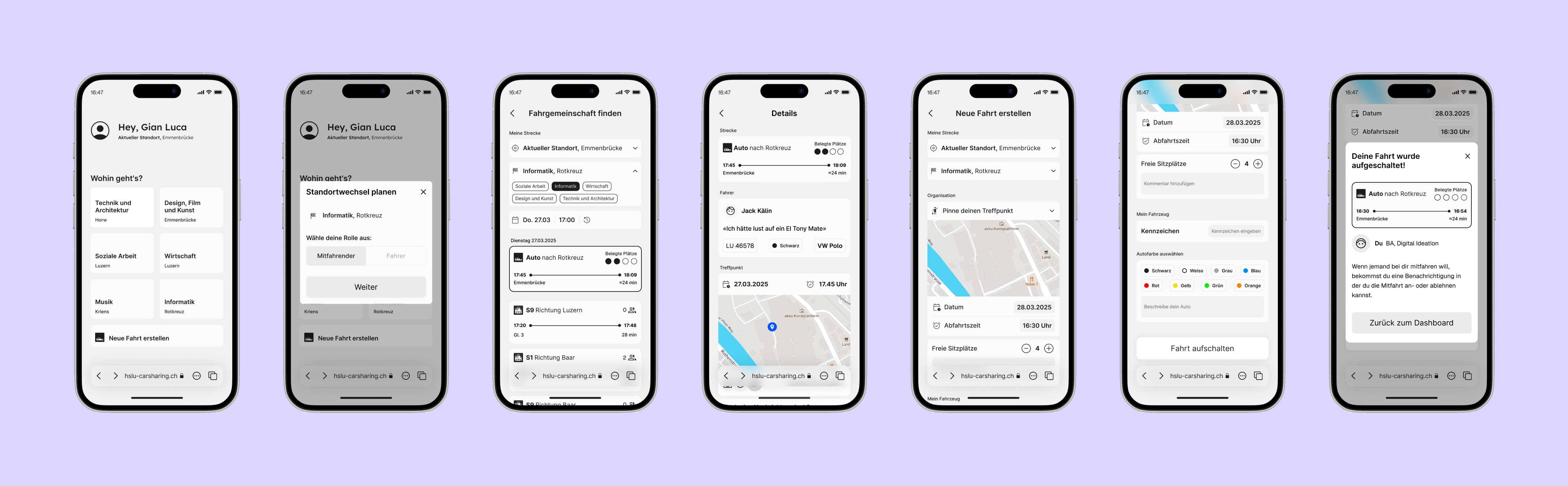
Based on the scenario-based testing of our mid-fidelity prototype, we implemented a set of refinements directly in high fidelity. The goal was to remove ambiguity at key decision points and make system states more predictable, especially around role entry, ride selection, and committing to a ride. The following cards highlight selected UI improvements that came out of testing feedback.

Clear vehicle identification
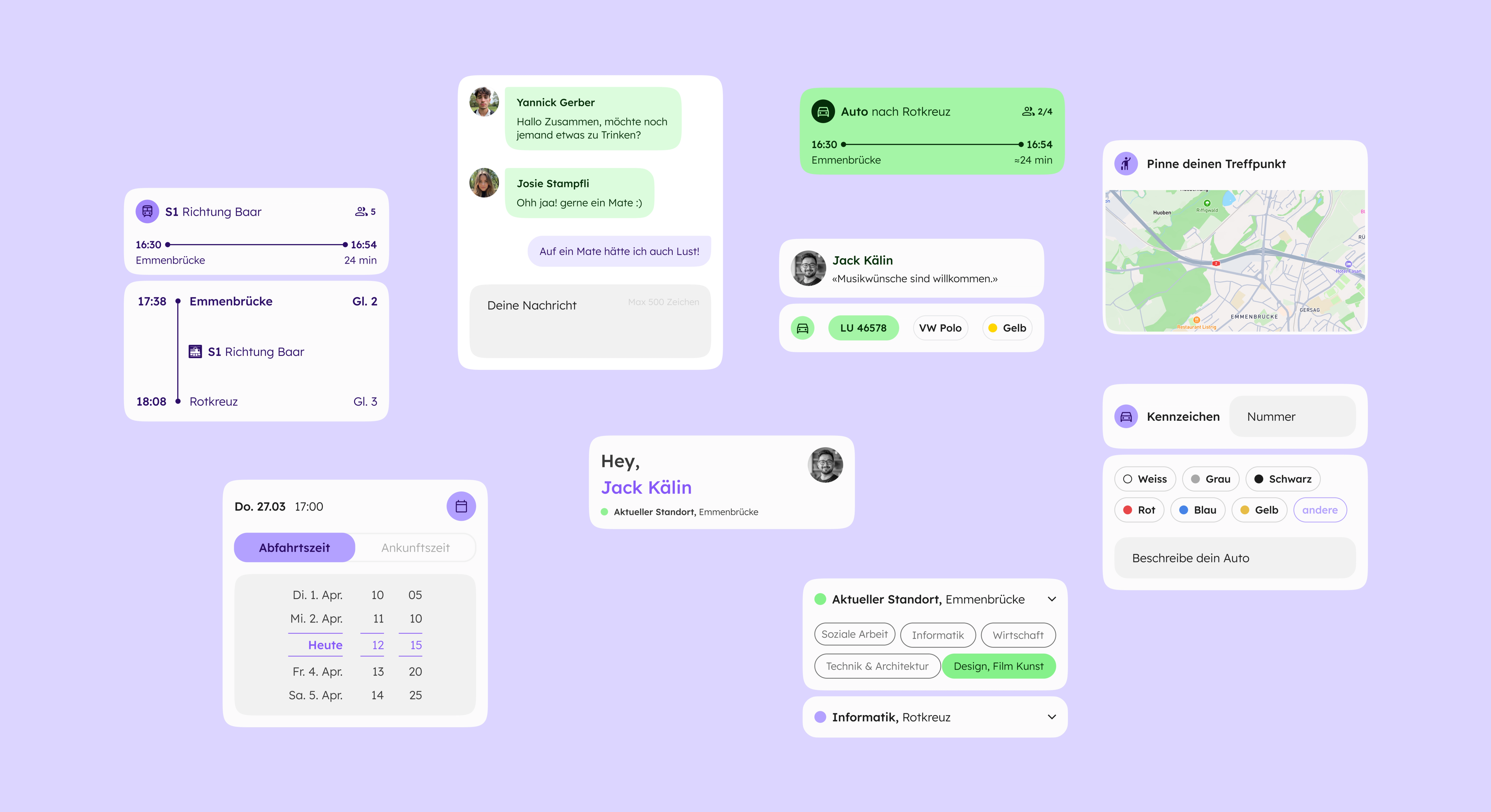
In mid fidelity, vehicle type and limited color options led to ambiguous identification. In high fidelity, we split this into a license plate field for clear recognition and a flexible car info component for color and custom notes.

Predictable role entry
Role selection via popup after choosing a destination felt unexpected. We moved this logic to the start screen: riders select a destination directly, while drivers use a clearly labeled “Offer a ride” action on the same level.

Clear action icons
Actions like viewing passengers or sharing a ride were unclear in mid fidelity. We replaced ambiguous icons with clearer, more explicit symbols to better match user intent.

Explicit seat availability
The original dot-based seat indicator caused confusion. We replaced it with a clear “x of y seats available” label combined with a people icon for immediate understanding.

Visible current location
Test users wanted to verify which campus was set as their current location. We made the active location clearly visible to support confidence during campus switching.

Consistent time selection
Different date picker styles and unclear arrival versus departure times created friction. We unified all date and time pickers and added an explicit choice between arrival and departure context.
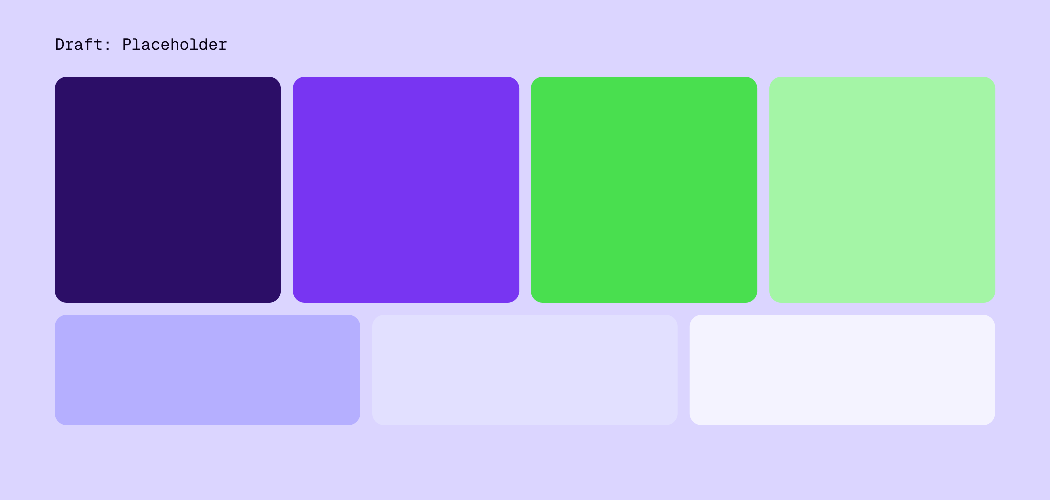
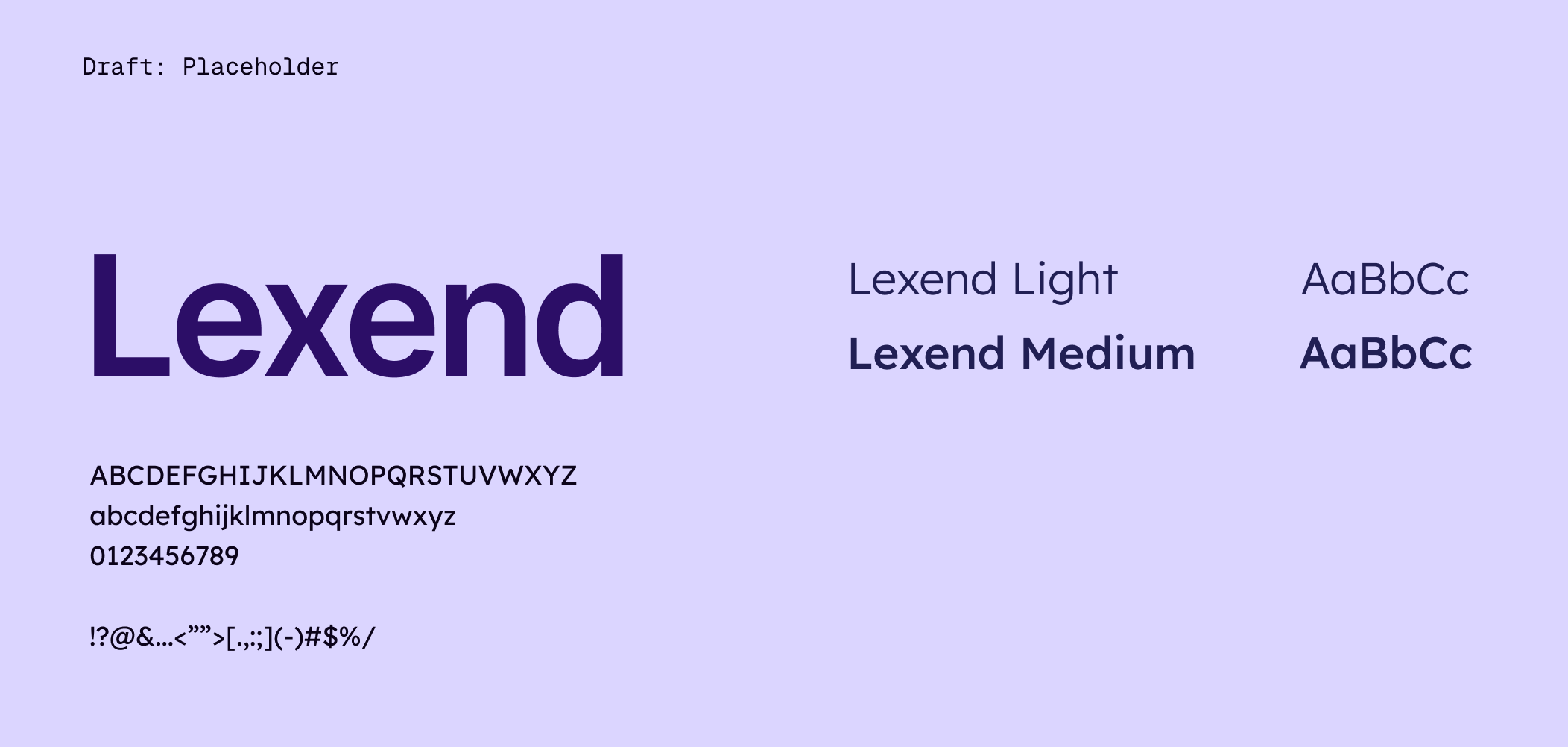
To make the high-fidelity improvements consistent across the product, we consolidated them into a state-driven design system. Core components such as cards, list items, buttons, and status indicators follow shared rules for states like browsing, pending, confirmed, and inactive. This resolves clarity issues at component level once and scales the same patterns reliably across flows, while keeping handoff and future extension manageable.
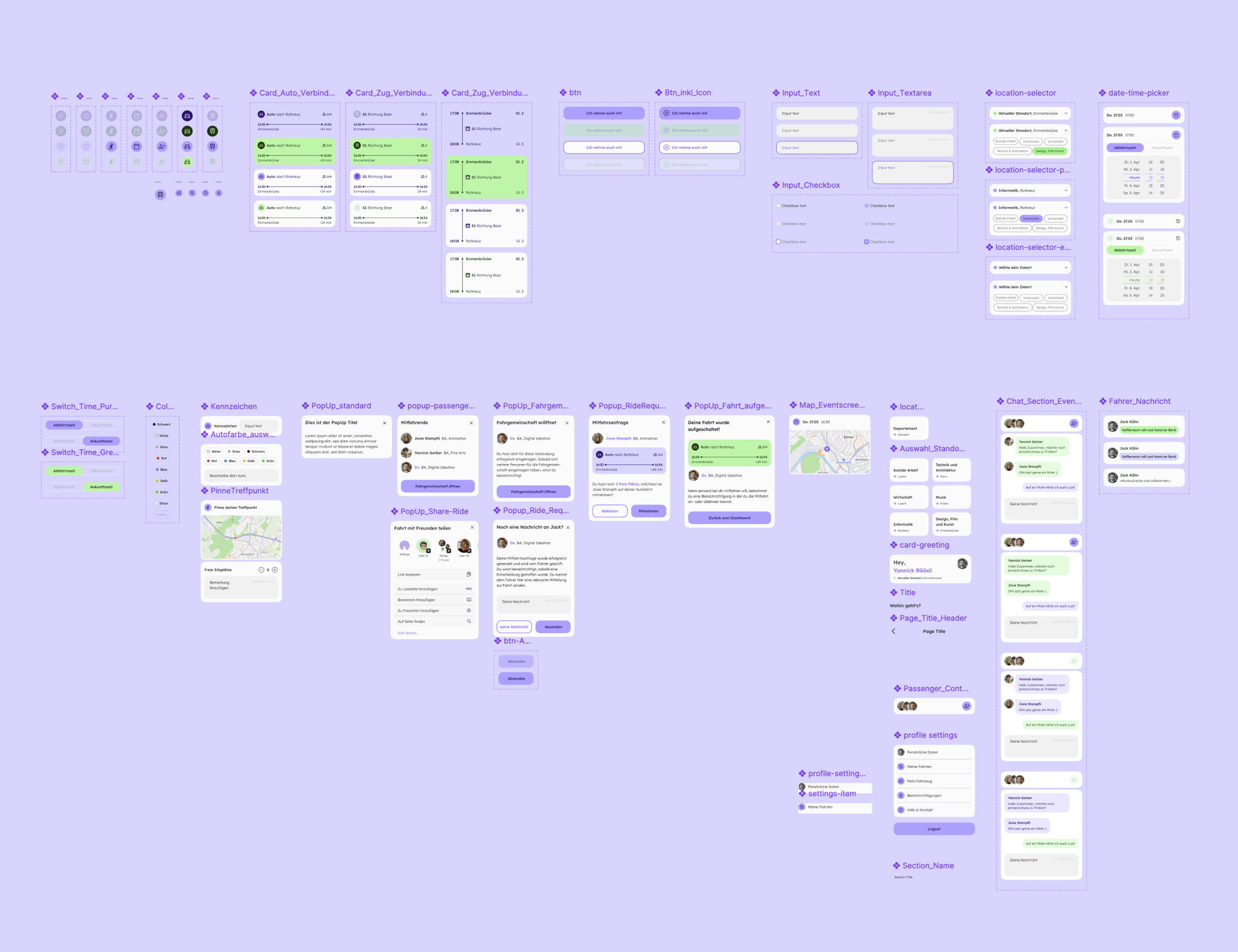
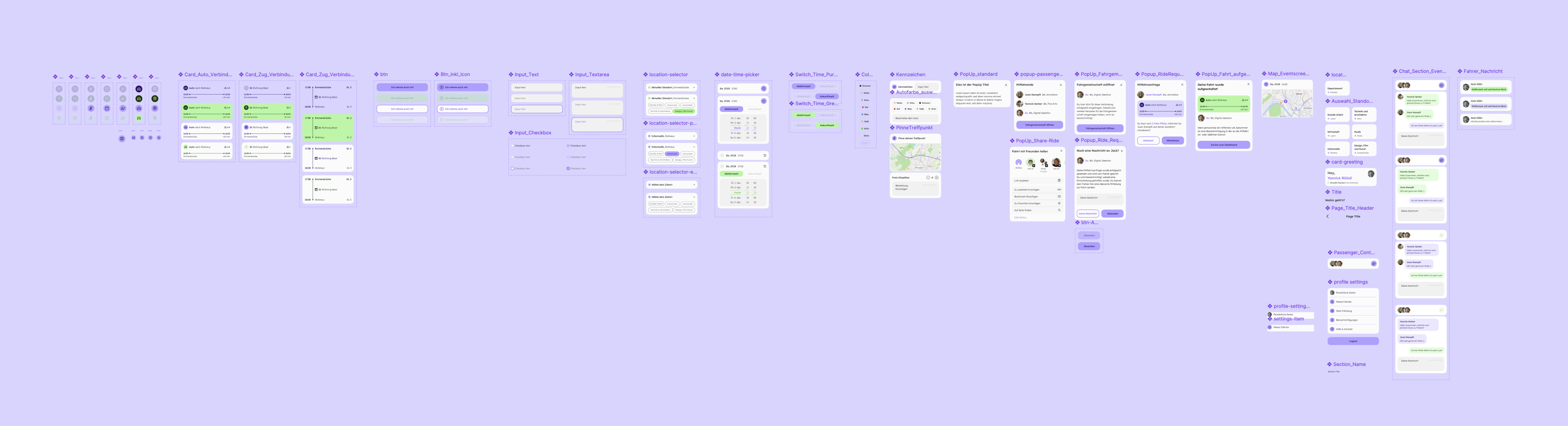
To support design-to-code handoff, we documented the product as a component tree aligned with atomic design principles. This helped clarify component responsibilities, naming conventions, and reuse boundaries, and created a shared structure for planning and implementation between design and development.
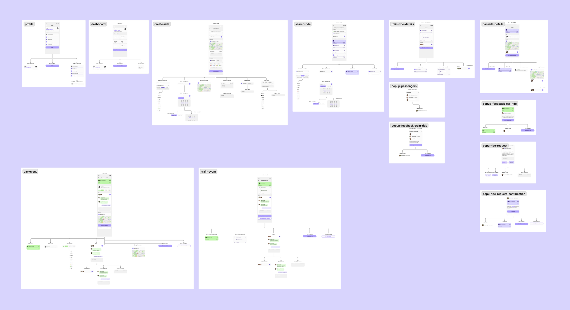
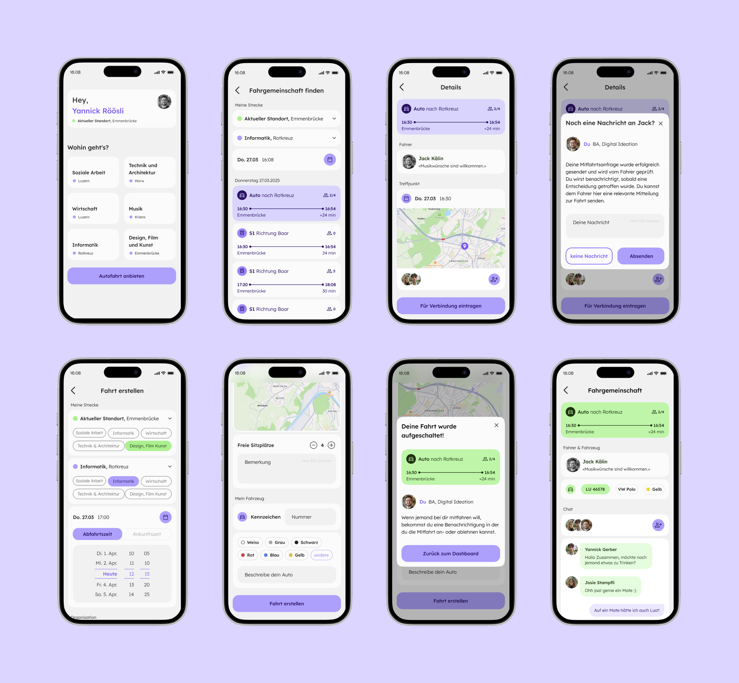
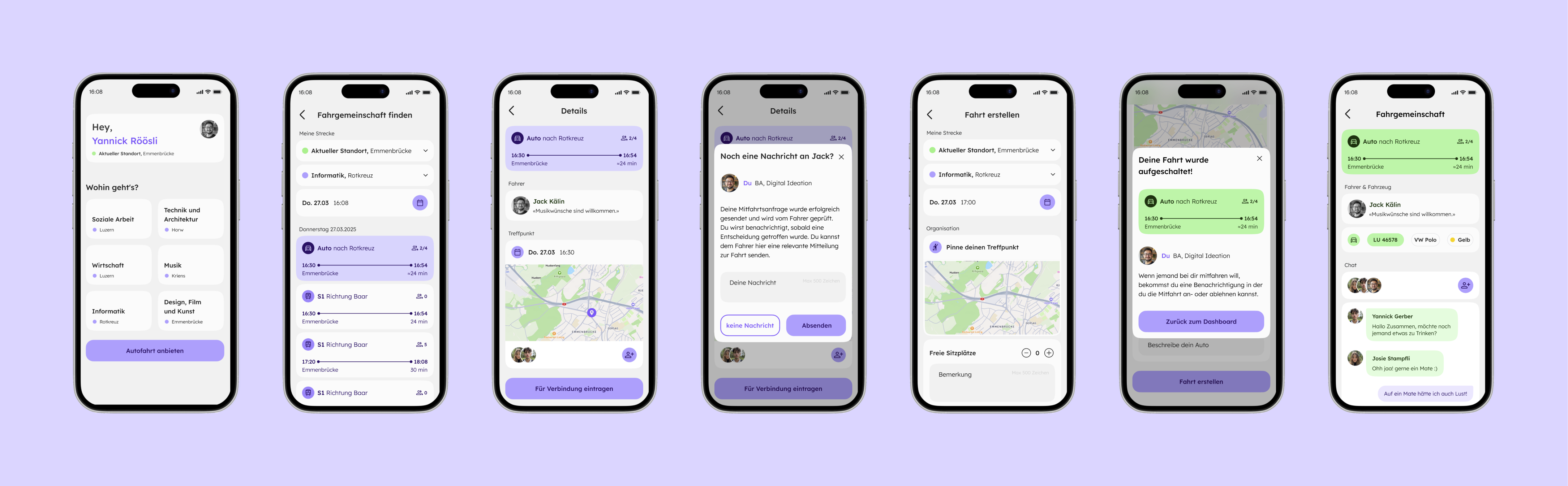
The final outcome of the project is a validated high-fidelity product concept for campus switching, developed by the design team and refined through iterative testing. The concept defines the complete end-to-end experience for both rider and driver roles, including destination selection, option comparison across train connections and ride offers, and clear system states such as seat availability, request status, and time context.
Based on this design foundation, the concept was further developed together with the development team into a functional mobile-first MVP web app. The implemented MVP reflects the validated structure, interaction logic, and component patterns established in the high-fidelity prototype, demonstrating how the design can translate into a working product.
The core journey was understood across roles
Test users could follow the main flow from selecting a destination to comparing options and either joining or publishing a ride. The distinction between rider and driver actions was clear after entry, and the overall sequence of steps made sense.
Clear states supported confident decisions
Explicit seat indicators, request and confirmation states, and consistent date and time selection helped users understand what was available and what would happen next without additional explanation.
Remaining feedback focused on refinement
Open points related mainly to wording, status messaging, and details around meeting point communication, rather than fundamental changes to structure or interaction logic.
Looking back, this project was a turning point for how I approach product work. It was my first time working fully within a Scrum framework and my first time taking responsibility as Scrum Master. The experience showed me that good outcomes are rarely a result of “working harder”, but of creating the right structure for decisions, alignment, and iteration. It also reinforced how much value comes from interdisciplinary collaboration when handoffs, responsibilities, and shared language are treated as part of the design work, not as an afterthought.
Scrum only works when planning is precise
Sprint planning became most effective when we defined a clear sprint goal, limited scope intentionally, and agreed on what “done” means before starting execution.
Retrospectives are where the process improves
The biggest workflow gains came from consistent retros, where we turned friction into concrete adjustments for the next sprint rather than repeating the same issues.
Interdisciplinary teams need shared artefacts, not assumptions
Working with developers and designers together made it clear that alignment depends on explicit artefacts, clear ownership, and early coordination, especially around handoffs.
Design-to-code collaboration starts with a shared component language
Defining component structure and naming conventions early helped reduce ambiguity and made collaboration between design and development faster and smoother.
Frontend skills grow fastest when they are connected to real product constraints
Contributing to frontend implementation taught me to think in states, components, and edge cases earlier, and to design UI patterns that remain feasible in code.
A focused snapshot of the methods behind this project. This condensed Workflow Atlas highlights only the phases and techniques applied here, showing the key artifacts and decisions that shaped the outcome.


