SDG Data Visulaization
Visualization of the data from SDG goal 12.a: Representation of renewable energies
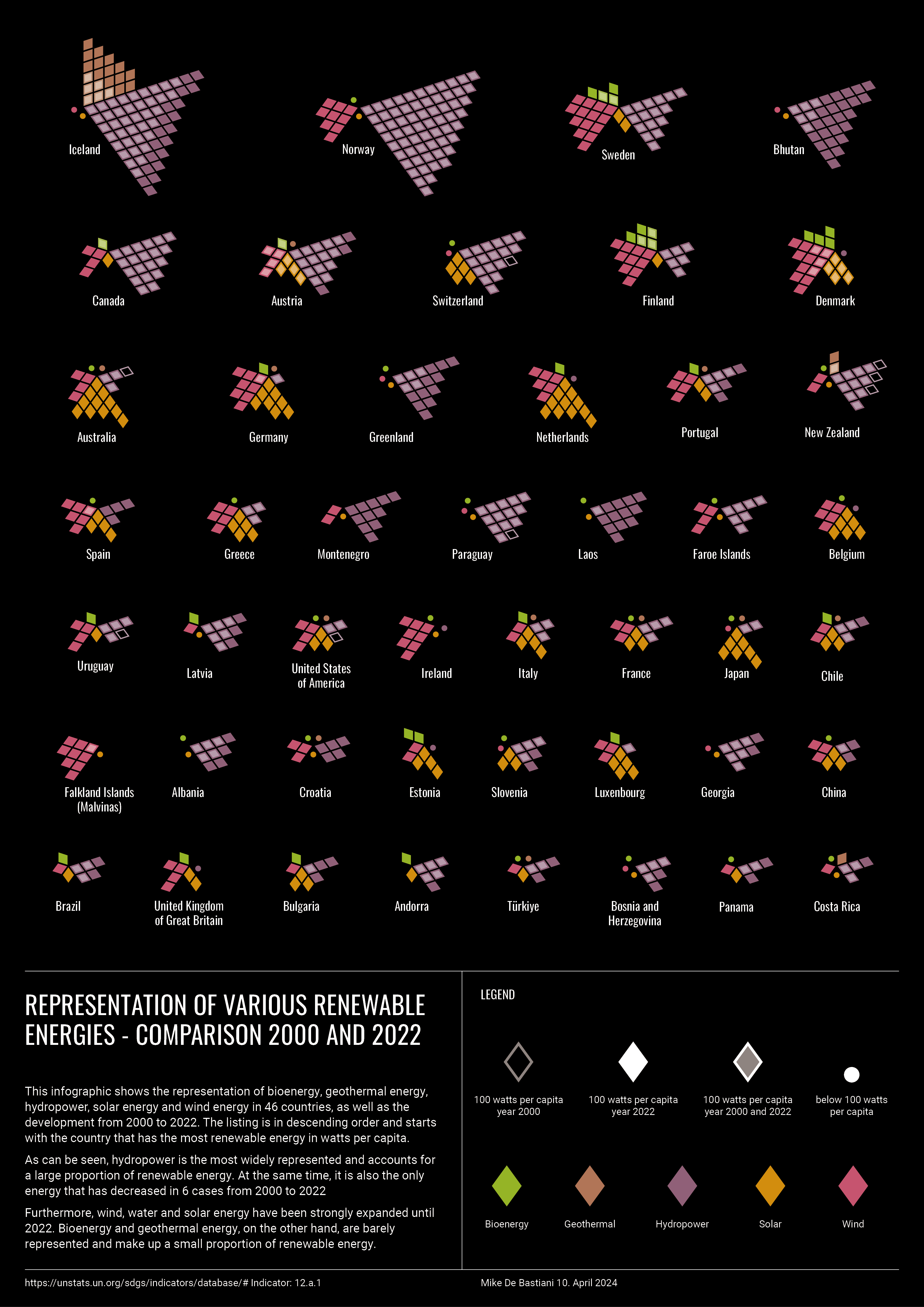
Analyzed UN SDG 12.a indicator data on renewable energy capacity per capita (2000–2022) and narrowed it to the 46 highest-capacity countries for a poster format. Developed a pentagon-based encoding where each energy source gets a segment and each rhombus equals 100 W/capita, with fill/outline showing change from 2000 to 2022. Arranged countries in descending order of total renewable energy per capita to support fast comparison.
Role
Analysis and visualization of data
Context
Student project supportet by Superdot
Timeline
9 Days in 2024
Team
Solo Project
Outcome
Data Visualization of SDG goal 12.a
The data set of SDG indicator 12.a
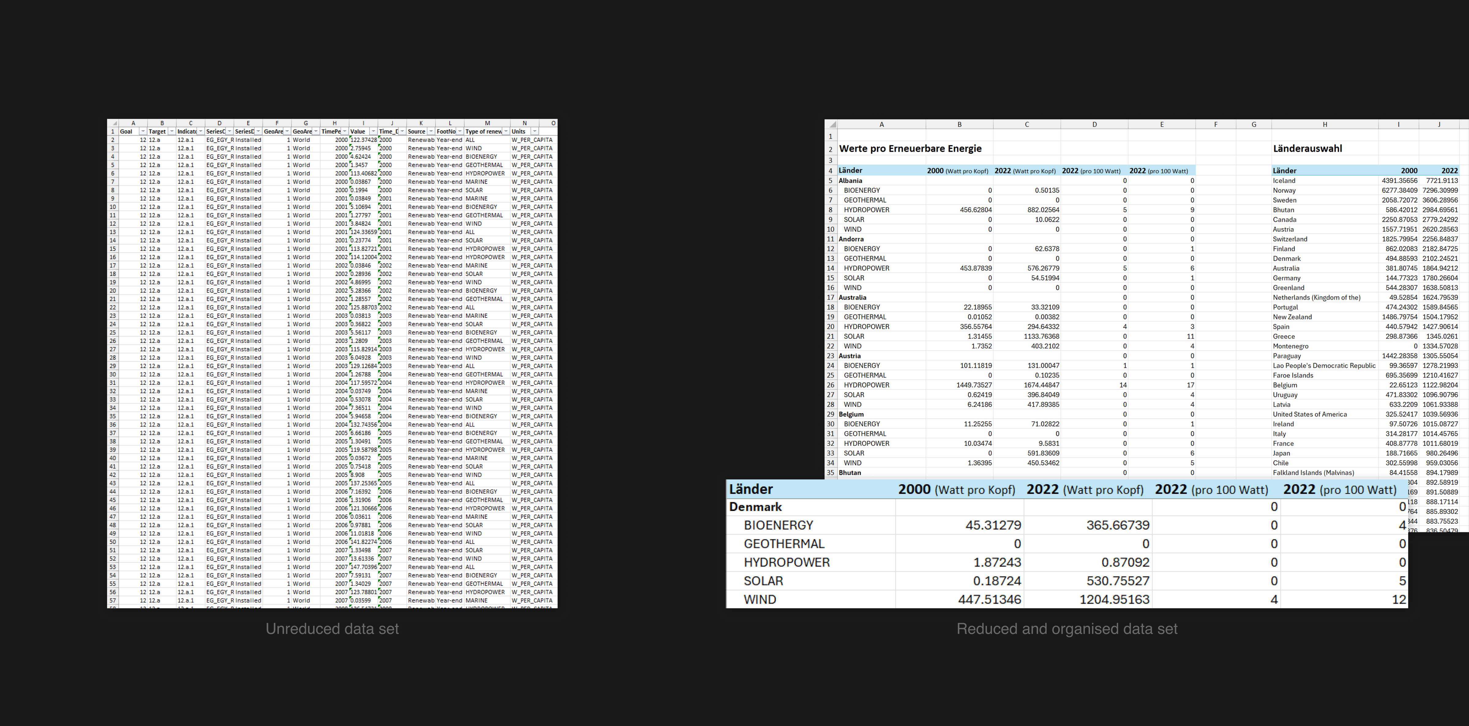
For my project, I received the data set for SDG indicator 12.a. This data set contains information on the representation of renewable energies - including bioenergy, geothermal energy, hydropower, solar energy, and wind power - in watts per capita for 257 countries and regions, recorded in the period between 2000 and 2022.
As this data set would be too extensive for presentation on a poster, I made a targeted selection of the data. My focus was on the development of renewable energy in the 46 countries with the highest capacity of renewable energy per capita. I compared the values of the different energies per country from the years 2000 and 2022.
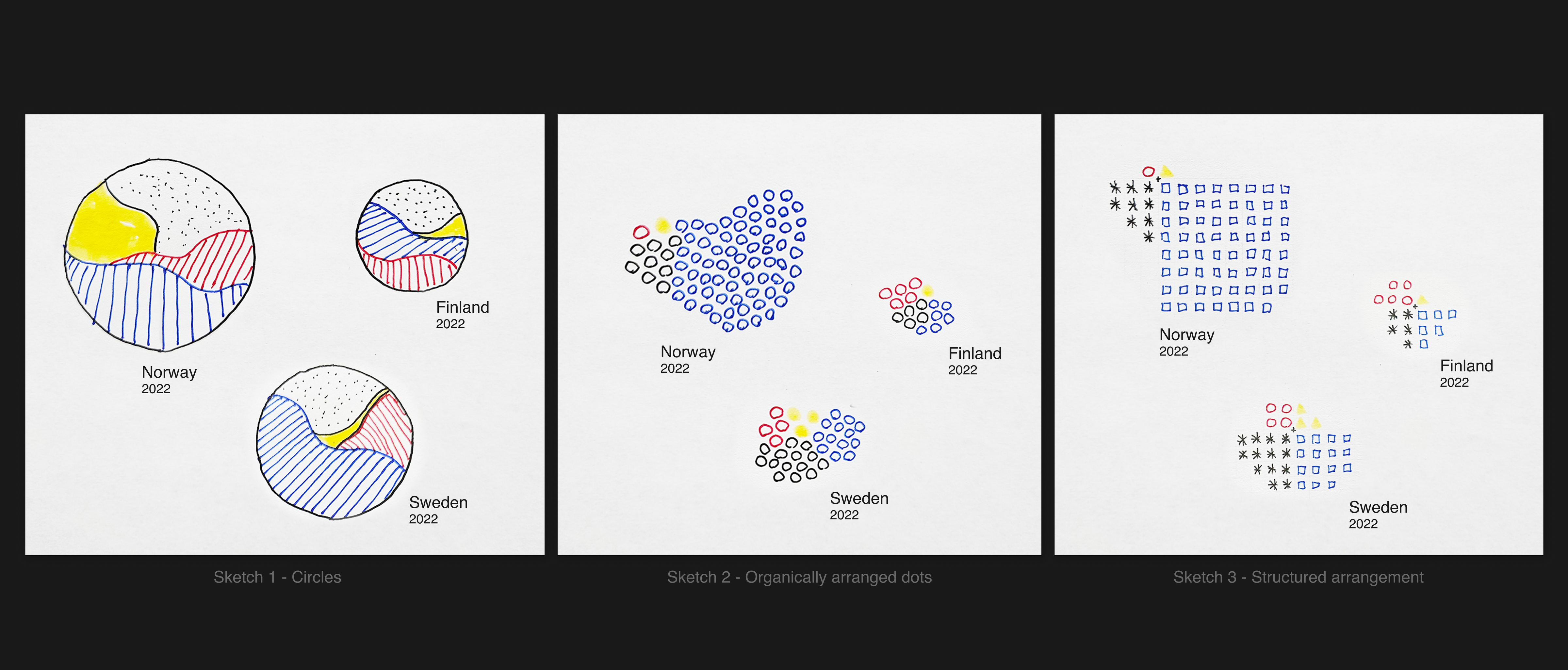
Rough sketches of visualization ideas
For the visualization of my data set, I created sketches for the countries Finland, Sweden, and Norway, each with a focus on four renewable energy sources to make the sketches more comparable.
In the first version, I planned to visualize the total amount of renewable energy per capita by the size of a circle and break down the percentage distribution of energy within the circle. However, I ended up deciding on a different approach: instead of varying the circles by total size, I used a fixed unit where each dot represents 100 watts per capita. I colored these units differently depending on the energy source and arranged them organically per country.
The organically organized placement proved to be less ideal, as it made the countries more difficult to compare. To make the comparison easier, I switched to a structured arrangement so that the differences between the countries are visible at first glance.
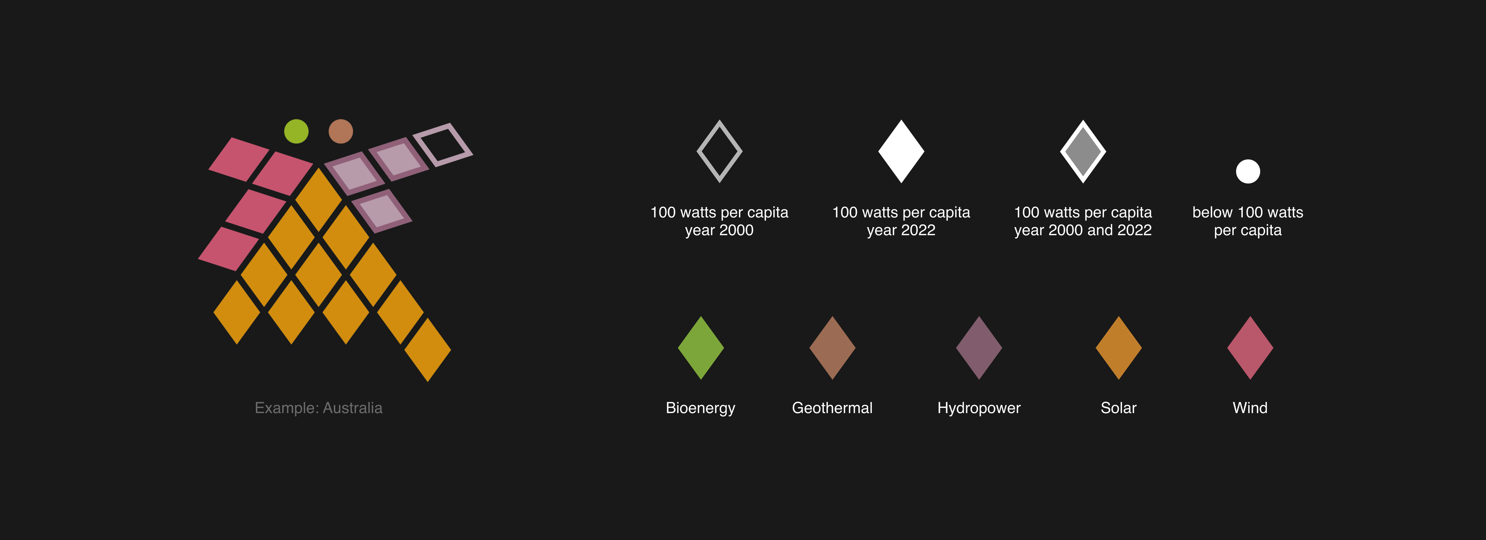
Scheme for visualizing the data per country
I have developed a specific visualization concept to show the development and proportion of renewable energy per country in the years 2000 and 2022.
As the data includes five different renewable energy sources, I chose a pentagonal arrangement. Each energy source receives one-fifth of the pentagon and is displayed within a grid. A rhombus is used as a symbol to represent an energy amount of 100 Watts per capita.
To illustrate the change in values between 2000 and 2022, I have developed different ways of displaying the rhombs. A simple outline indicates that the value per capita in 2000 was higher than in 2022, while a filled rhombus means that the value per capita in 2022 was higher than in 2000. If the rhombus has an outline with a transparent fill, the values remain identical in both years. A dot is used if the energy source is present but remains below 100 Watts per capita.
Example of Australia:
The visualization shows that bioenergy and geothermal energy are present but below 100 Watts per capita. Hydropower had a higher value per capita in 2000 than in 2022, which is shown by the rhombus contour. Solar and wind energy were below 100 Watts per capita in 2000, but show a significant increase in 2022 and are shown as filled in accordingly.
Final poster of the data visualization
The end product is an A3 poster with a predefined layout for the description of the visualization and the legend.
The visualizations were arranged by country, sorted in descending order of the total amount of renewable energy generated per capita in watts. This makes it possible to recognize at a glance which countries achieve particularly high levels of renewable energy per capita and how their use is distributed across the different energy sources.