Tekusa Flowerpots
Rebranding of a company for garden decoration and outdoor design
I realized the rebranding for a company that offers high-quality garden decoration products. The goal was to create a modern brand identity that communicates the company's values in a clearer and more appealing way. The rebranding includes the development of a new logo, the introduction of a fresh color palette, and the selection of suitable typography.
Role
Brand Designer
Context
Project for TEKUSA AG
Timeline
3 Days in 2023
Team
Solo Project
Outcome
Logo & Reduced CD

Concept and idea behind the logo design
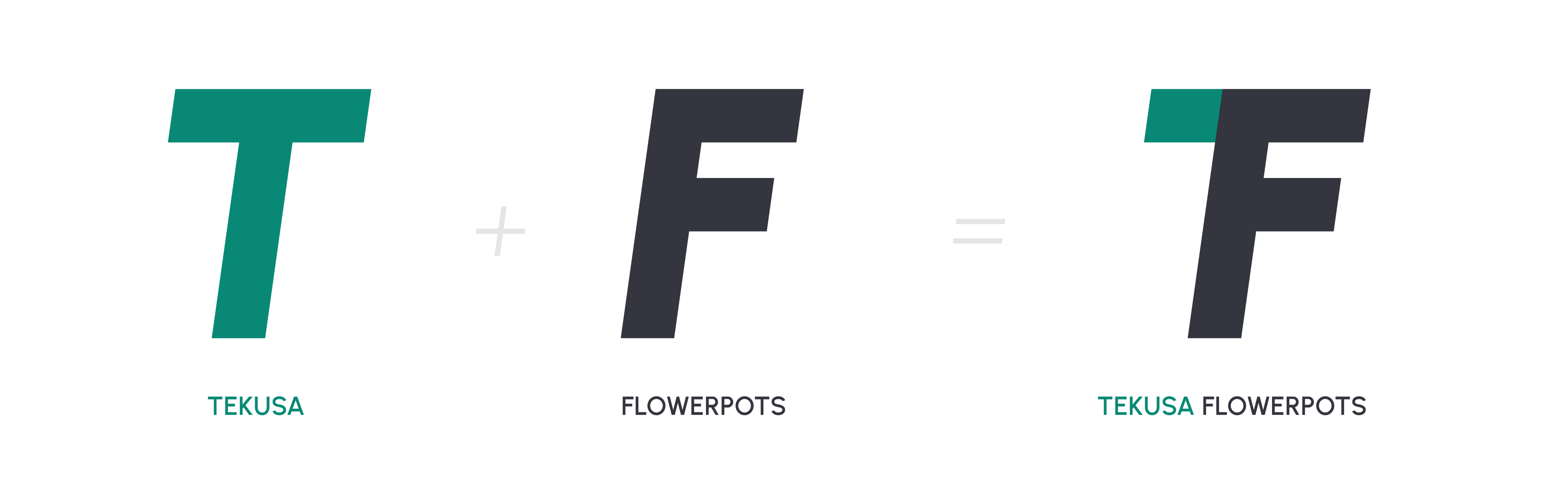
For the company "Flowerpots and more", a subsidiary of "TEKUSA", the task was to design an independent logo that stands out from the parent company. Nevertheless, a subtle reference to TEKUSA should remain without using the original logo itself. In addition, the symbol should also work in just one color so that it can be engraved in metal, for example.
Based on this requirement, the idea was born to unite the initial letters of "TEKUSA" (T) and "Flowerpots and more" (F) in a single symbol. The result is a symbol that subtly picks up on the connection to the parent company and at the same time emphasizes the company's independence.
Further development of the concept to the final logo
Based on the concept for the initial symbol, the design was further developed to better reflect the company's values. The goal was to develop a design language that maintained clear and precise lines but also conveyed a slightly organic feel - similar to the shape of a leaf.
For the construction of the final logo, I took a rectangle in which I rounded off the two opposite corners, which is intended to be a reference to a leaf. I then used this basic shape to design the symbol. The size and spacing of the elements were first arranged optically, then I aligned the elements precisely depending on each other, which resulted in the spacing.

Adding the wordmark & colorway
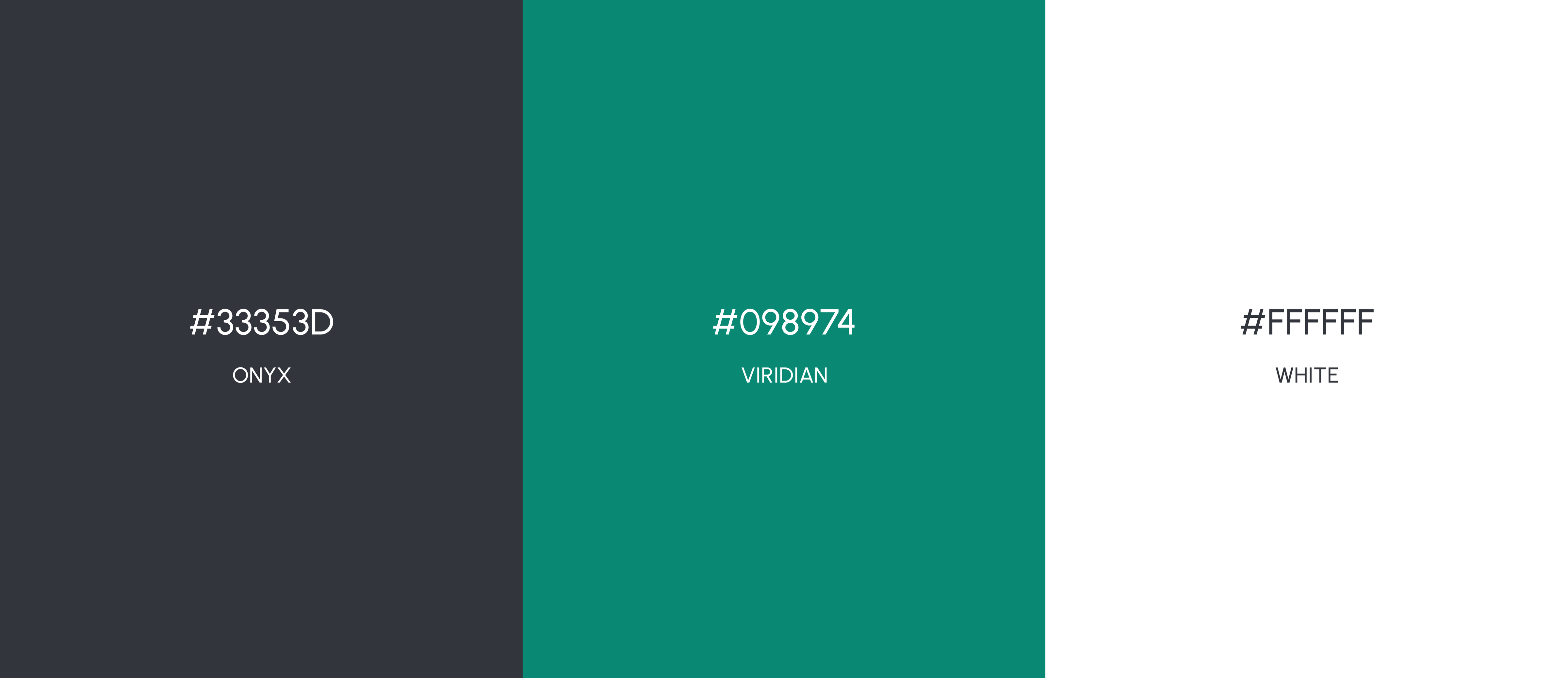
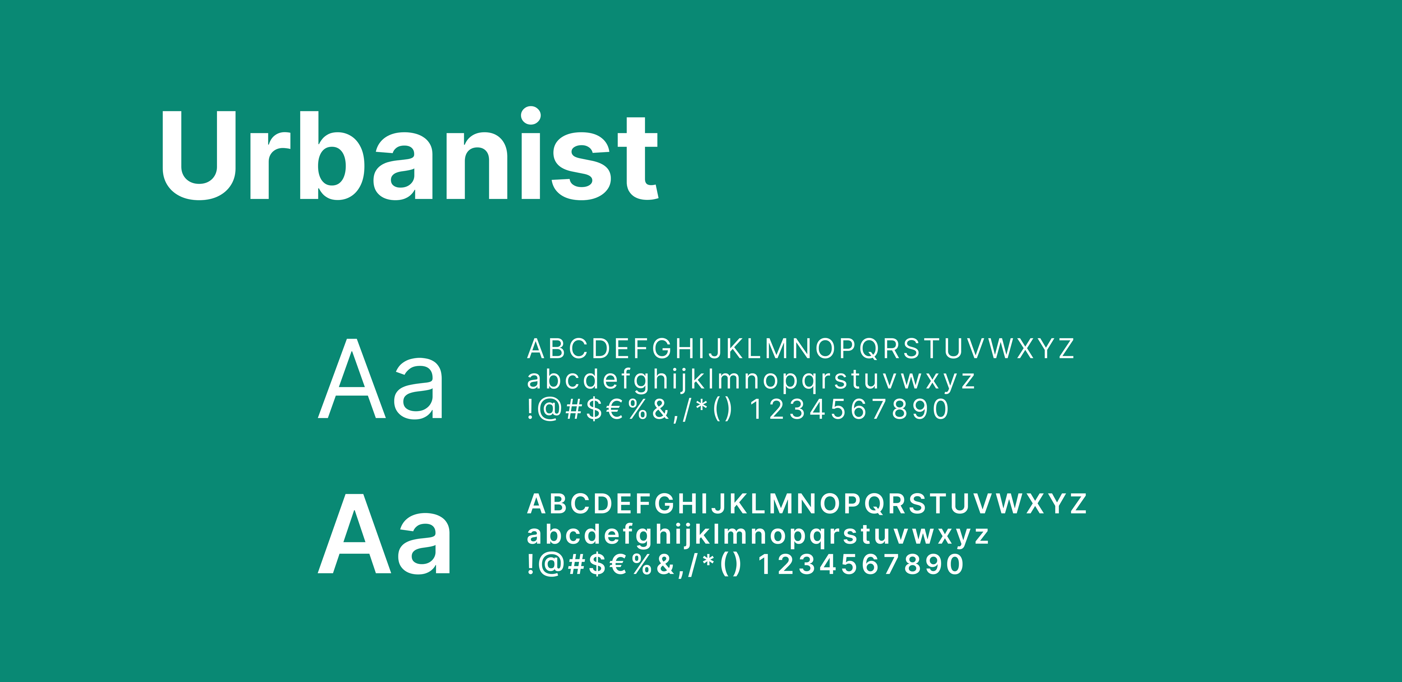
Although the symbol itself should function in only one colour, the wish was expressed for a logo with a word mark. For this step, I defined the final colours and typography, which are listed further below.
What was important to me for the logo with the wordmark was the combination with its own colourway. The element on the far left, which forms the T of Tekusa, should be coloured green so that it looks like a leaf and stands out more clearly from the F. In addition, the "and" from the wordmark is also coloured green, which picks up on the relationship between the T and F to subtly reinforce the reference to TEKUSA.